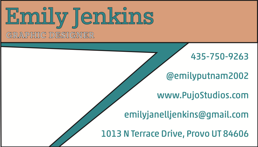
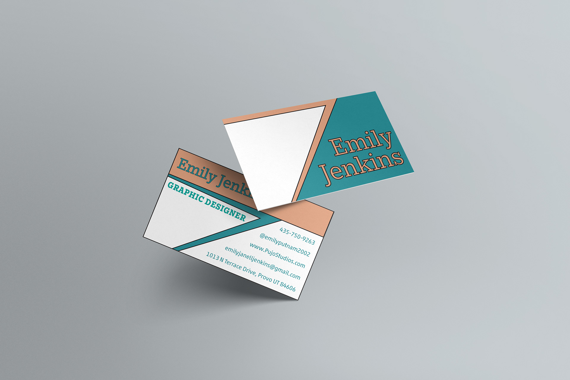
Business Card Design by Emily Jenkins
I designed this business card to feel bold, modern, and polished, something that reflects both personality and professionalism. The geometric layout and color blocking help it stand out, but everything is still clean and easy to read. I focused on creating a balanced composition where the name really leads, but all the contact info is still clear and accessible. Typography plays a big role here: I paired Egyptian Slate Std and Akko Std to create contrast and hierarchy without losing cohesion. The palette, teal, white, and a muted peach, was chosen to strike the right balance between creativity and trust. The goal was to make a strong first impression, and to reflect the kind of thoughtful, intentional design I bring to every project.